There are a few elements that you should consider that are specifically related to our digital printing process. Follow this advice to ensure you get the best possible printed results:
Total Ink Limits
Avoid using colours with a total ink limit over 275%. Any colours exceeding this will be automatically re-mapped to their nearest equivalent so there may be a shift in colour.
Quiet Zone
Where digitally printed items are concerned, bigger IS definitely better – we recommend at least 10mm. Having important elements such as text less than 10mm from the edge may be printed with unexpected results.
Design Elements
Where possible, keep the design simple, lots of white space tends to work well. Large areas of flat colour can be problematic, resulting in an uneven solid that can look banded. A large area is defined as larger than 40mm square.
Using Grey
To achieve neutral shades of grey use black only. It is best to avoid using grey tints below 20% or over 80%. Large areas of grey can appear patchy and uneven - consider adding a texture to help mask this. Greys that are made up of all four CMYK printing channels have a tendency to print unevenly with a yellow cast to them.
Gradients and Blends
Gradients don’t print well, If you must use them, try adding texture or a low amount of noise to ensure a smoother transition from light to dark. Alternatively, limit blends to less than a 50% tint change. Grey tints are less forgiving than other colours. You’ll get better results if you create your blends in a raster based application such as Photoshop®.
Tints
Consider adding texture to any large areas of colour, especially on lighter tints. Avoid using tints below 10% as these are likely to disappear when printed.
Digital Products with specific requirements
Digital Booklets
Thin White Border
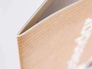
If you are designing a booklet to be used on a Thin White Border product then you do not have to add the white border yourself. We will add the border automatically for you. The border that we add
will vary in size depending on the thickness of the booklet. If you do wish to add your own thin white borders then ensure that this is at least 10mm wide.
Creep
 When designing your digital booklet you need to allow for creep. Bear in mind that with the Thin White Border products, the thickness of the border will vary throughout the booklet due to the creep being trimmed off.
Digital Sticker Sheets
If you are designing any of our precut digital sticker sheets then please ask for a template. If you are supplying us with one copy of the design for us to duplicate then please ask us for the dimensions.
Digital Folders
Our Digital Folders are cut and shaped before they are printed on our digital equipment. That means that you don't need to supply us with a cutter guide.
We have a template available for you to design within, please ask for a copy. The template contains guides on the Finishing Layer to indicate the cut and scored elements of the Folders to help you layout your design.

Thin White Border
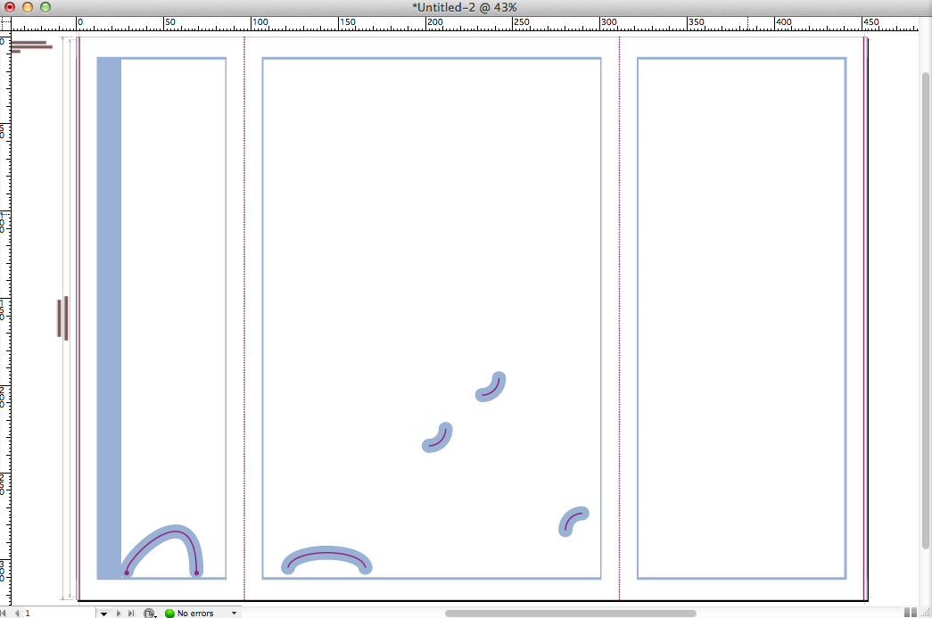
There is a 10mm non-printable area around each panel, which results in a thin white border on each panel, illustrated above. The white frames are the non-printable areas, artwork must not enter these areas.
Quiet/Safe Zone
There are quiet zones around the interlocking flaps and and business card slots (shown above), we recommend that artwork stays clear of these zones.

 Print this page
  When designing your digital booklet you need to allow for creep. Bear in mind that with the Thin White Border products, the thickness of the border will vary throughout the booklet due to the creep being trimmed off.