If your product is square cut follow the guidelines below. If you are ordering a shaped large format product, please refer to How to supply files for Shaped Large Format products.
Designing Large Format Posters is slightly different to designing for litho print, partly because of their increased size but also because of the difference in technology.
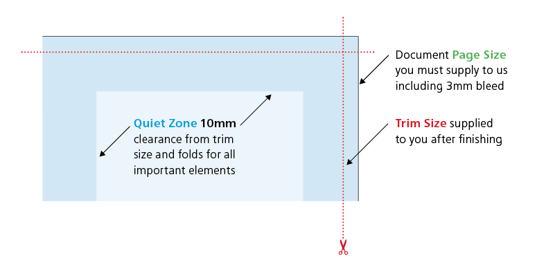
Increased quiet zone
Ideally you should position images and text at least 10mm from the edge of the Poster. For best results, make your background bleed fully to the edge of your artwork if it is within 10mm of the edge.
Resolution
Large Format Posters are designed to be viewed at a distance (usually of at least 1m). This means that images don’t need to be as high 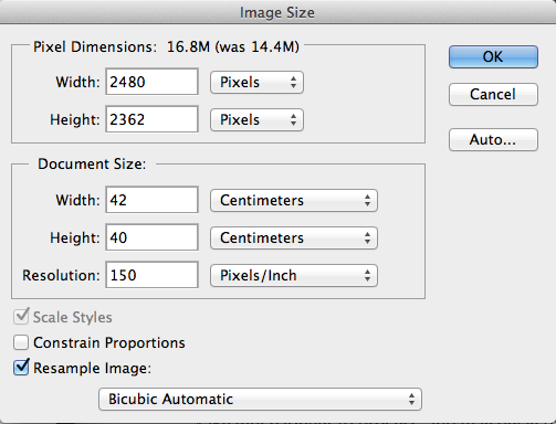 resolution as on litho printed items. We recommend that the images inside your PDF for Large Format Posters are set at a maximum of 150dpi. Any higher won’t make any difference to final print, but will take much longer to process, and may delay the processing of your job.
Use of colour
To create a good solid black, use rich black (100% K with 40% C). Don’t use four-colour black and try to keep all elements under 225% total ink limit. It’s best to avoid solid colours of only one ink (i.e. pure cyan, magenta, yellow or black) as these can be susceptible to slight “banding”. Also, any greyscale images should be converted to CMYK prior to being printed on our large format equipment.
Colour variance
Due to the different technology used to produce our Large Format range, and the limitations of the substrates, it’s unlikely that colours will match our range of litho printed products.
Text elements
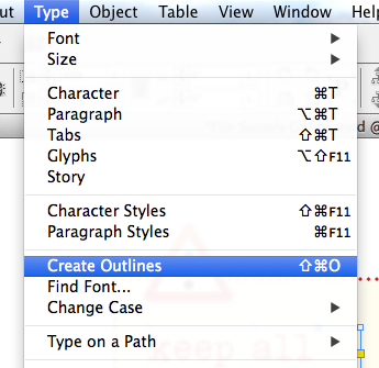 We’d recommend that you keep your text to a minimum of 14pt. Use a vector-based application like Adobe InDesign® or Illustrator® to set your text, rather than creating it in a bitmap-based application such as Photoshop. It is best to convert all text to outlines for large format printing.
Pop-up banner stands
When designing a Pop-up Banner, remember that there will be an area at the bottom of the poster where the poster has to wrap around the spindle in the stand, this area won’t be visible so we’d recommend not putting important elements within 200mm of the bottom of your design (you’re fine to bleed colour and images to the bottom though).
Outdoor banners
Outdoor Banners are designed to be viewed from a distance so bold graphics and colours work best, try to avoid small text as it won’t be legible. If your banner is to be supplied with eyelets punched in, you’ll need to allow space on your design for this. Please ask us for a template as this will illustrate where the eyelets are to be positioned (don’t delete the cross hairs though, we’ll use those in our production process).
Ceiling Tiles
Ceiling tiles are ordered in batches of 10, so you can have 10 tiles all the same, or you can have 10 different tiles. If you need 20 different tiles you need to set up 2 jobs each containing 10 different PDFs.
Canvas prints
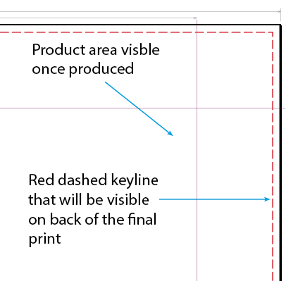 On Canvas Prints, the canvas fabric has to be tensioned around a wooden frame. This means that extra bleed is required on all four edges. We can supply you with a template to work from, just ask. On the templates, the product size is the area that will be visible of the front of the canvas. Anything within the large quiet zone indicated will disappear from view once the canvas is mounted.
Framed Canvas PDF files need to be supplied with the dashed red 2pt keyline which is present in the template, this will appear on the reverse of the frame once the canvas is finished. If you are using images in your design, please don’t embed any colour profiling as this will affect how your print will look, just send us your PDF in CMYK format.
Things to avoid on large format printing
- Gradients are likely to band when printed, if you do need to use a gradient then keep the colours close together on the the colour wheel and keep shade changes to a minimum.
- We'd recommend that the images used for large format printing are flattened prior to creating your PDF. Save them as TIF or JPEG files where possible.
- Transparencies can cause problems when applied to graphics that are to be printed as large format, you'll need to flatten any that are used.


 Print this page
 resolution as on litho printed items. We recommend that the images inside your PDF for Large Format Posters are set at a maximum of 150dpi. Any higher won’t make any difference to final print, but will take much longer to process, and may delay the processing of your job.
 We’d recommend that you keep your text to a minimum of 14pt. Use a vector-based application like Adobe InDesign® or Illustrator® to set your text, rather than creating it in a bitmap-based application such as Photoshop. It is best to convert all text to outlines for large format printing.
 On Canvas Prints, the canvas fabric has to be tensioned around a wooden frame. This means that extra bleed is required on all four edges. We can supply you with a template to work from, just ask. On the templates, the product size is the area that will be visible of the front of the canvas. Anything within the large quiet zone indicated will disappear from view once the canvas is mounted.